52 commentaires au sujet de « Bengale Occidental Gennes »
Unai Houston
Hello,
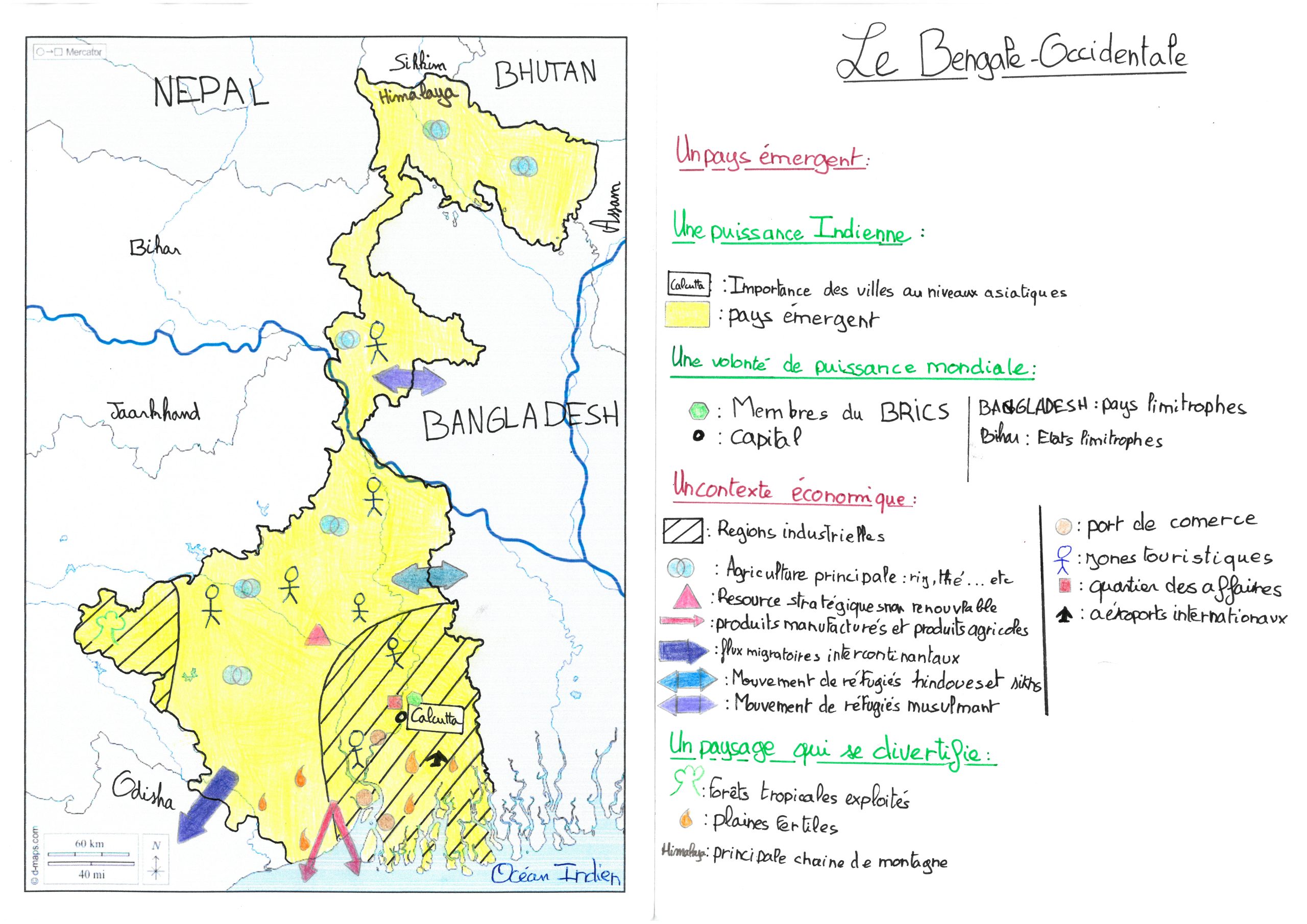
I found your map very interesting and pretty, but I think you could change the color of the arrow because it’s confusing. And you can’t use stickman and little airplane for symbols and there is no orientation. But your map is actually fine for the rest.
Hello,
I hope that you are having a great day in Gennes, your map is really good, I really like the coloring, and the legend is really beautiful bu there is a line cutting right through the Bengale which I did not understand. Bu you have very good organization and we can see the symbols really well on the map. But even though your map is kind of cut, it is still really good.
Good luck.
Your comment is alright, but instead of writing « but » you wrote « bu ». You also said « the Bengale » which is not right because it is just Bengale when you are talking about it.
-Lukas
Hello,
Beautiful and extravagant map, I can see you put a lot of effort and love into this map, your handwriting is fantastique and very easy to read *applause*. The hierarchical organization is well organized but the figures must be easy to draw so you can draw them the exact same way every time. I appreciate the way you have outlined specifically Bengale to make it stand out, and the way you highlight the important river is just *chefs kiss*. The colors are very well chosen, bravo.
Good luck and beautiful work. ╰(*°▽°*)╯༼ つ ◕_◕ ༽つ
hello how are you all doing, i hope that you are not too cold at Gennes. first I would like to tell you that you did a great job with the map and the legend is really good, the figures are good but i think that the figures like the arrows are not straight enough but it is okay.
the map and the legend respond well to the question.
other than that, the colors are good and the map is really good.
Congratulation and have a good continuation.
Everything in your comment is good, besides the capitalization, and when you said congratulation which doesn’t make sense. Besides that, your comment is good.
-Lukas
Hello, I hope you are doing well 💓,
Congrats on the beautiful job on your map,
You guys have a lot of information but there could be more on the flow with some directional lines, everything is well organized and very aesthetic.✨
The legibility could be better because sometimes it’s small and hard to see your writing and your symbols.
On the other hand, you did a pretty good job answering the question.
In conclusion, your presentation was super! ❤️
Thank you so much for your attention!
Good Luck!! 😀
Hello, I hope your doing well
Positive points:
-there’s is a lot of information in the hierarchical organisation
-your map is wonderfully coloured
– your map is overall very aesthetic
Negative points:
-there’s is a lot of information in the hierarchical organisation
-the writing is quite small
-however, you need to respect the hierarchical organisation principles
-the hatching lines make it rather hard to see
Overall you map was great. I wish you good luck for the rest
Good luck ʕ•́ᴥ•̀ʔっ
Hi!
Hope you’re having a great day so far and that you’re good!
First off, I really want to let you know that your map looks beautiful !
✨Positif points✨
– The map is neat !
– The maps’ legend is very neat as well !
– As far as I can see, everything on the maps’ legend is on the map, itself !
– Your map is very descriptive and it answers well to the question « How does West Bangal participate in the globalization? »
– The map is fun to see. (By the way, the stickmen are adorable!)
– You didn’t forget to put the title!
– All the graphical design is very aesthetic !
– Your maps’ legend is very organized !
– We can see perfectly where West Bangal is located!
– The colors are beautiful !
– You have been very creative !
* Negatif points *
– Some handwriting is too small…
– The symbols aren’t always neat…
✨Advice✨
– You should put a little more colors!
– You should put small and big circles to informe us of how many people there are in this place!
✨Conclusion!✨
I looove your map! You’re doing great! Good luck for the futureeeeeee! 😀 😀 😀 😀 😀 😀 😀 😀 😀 😀 😀 😀
Your comment is good, I am not sure if the use of emojis was necessary, and you had a few spelling errors such as positif which needs to be positive, and negatif which needs to be negative. You put a comma in map, itself which ruins the flow of the sentence and doesn’t make sense. Most of the text lacks a voice and character, it feels robotic, almost like you google translated it. Besides that it’s good.
Hello, I hope you’re doing well,
Your map is well made and it is clear that you spent a lot of time on it. The yellow is colored in nicely as well as the arrows. The map is traced neatly and the industrial regions are easy to see thanks to the hatching lines. I think it would have been better if you had outlined all of the symbols with black or another color to make it look a bit neater. The symbols chosen for the touristic zones and the fertile plains are not consistent on the map, sometimes it’s a bit bigger or smaller and other times a bit deformed. Overall I think that your legend is well organized and that the handwriting is neat and legible. The directional lines for the flows are colored well, the colors chosen aren’t too similar and are easy to distinguish from each other. However, the red arrow looks a little deformed near the end. All in all, you have a lot of information and many relevant facts about globalization. Great job on your map and good luck!
Hello from Houston.
Hope you’re having a great day in Gennes if it is not too cold outside 🙂 :0.
Your map is very well realized and is very aesthetic. The hierarchical organization is very clear but the symbols could have been done using a nomograph. Also, I do not know what « BRICS » means so it could have been useful to specify what it is, and « Importance des villes au niveau asiatique » does not mean much if it is not explained. But anyways, have a great time and hope you stay safe!
Maxime
hello
This is a very good map with a lot of colorful details there is a lot of information and your legend is very organize, you are missing a compass
Good luck lads
I think that your map is esthetically good, the legends shown on the map are rather clear, although I feel like the legend section is rather small so hard to read, it’s fine, it’s not illegible at all, and it’s also very organized. Generally, the artwork and map are very good.
Your map is really colorful and has a lot of information on it. Your legend is well organized and beautiful. The only thing you could have added is a compass rose which would have made your map a bit more colorful.
Hello!
I hope you are well; I overall think that your map is amazing it has beautiful colors. Although I understand all of the little signs but maybe next time can you be a little more creative with the signs? Apart from that I understand how important it is in globalization.
Have a wonderful day,
Agnes
Hello,
Your map is neat, legible and colorful. The legend is easy to read and properly respected. The only down fall I could find is the absence of a compass rose. Make sure you don’t forget next time. Other than that, good luck.
Hello!
At first glance, I can easily see that you did a good job. Your legend is well made, has plenty of information, and is very organised. Your icons are basic, which is good but you don’t have a drawn compass rose/ wind rose, not a big deal but it would’ve been great to see it. It’s got good colours and good details. Overall an excellent job. Good luck you guys!!
Have a great day!! 👍
Hello,
You did an excellent job! Your map is colorful, organized, and very well done. It is very clear that you spent quite a while drawing, coloring, and finding enough information to make this. The symbols are creative, vibrant, and nicely drawn. Even though the hand writing could be a little neater, the legend is very organized and does not lack in color. Overall, I find this very nicely done.
Good job and good luck!
Hello!
Your map is really well done and we can tell that you spent a lot of time on it.
The legend is well organized and full of information
The map is also very neat and the symbols are well done, the symbols were also creative.
The only negative points I have is that the handwriting is a bit small and it is cluttered.
Overall well done! Good luck!
Hello!
Your map is really well done and I love the colors! The legend is so pretty and very organized! The map is also very neat and the symbols are very pretty! The only negative points I have is that The map is that the handwriting is a little Bit tiny and hard to read. Good luck for the next round!
Hello,
I hope that you are having a great day in Gennes, your map is really good, I really like the coloring, and the legend is gorgeous. the map is organized and we can see the symbols on the map. good job.
break a leg!
Ivan awty
Hello,
Great job, your map is very well done, the symbols are visible and the map itself is very well organized and is very colorful. The legend is very organized and is full of information. the handwriting is legible and is neat. All though the symbols are could be nicer, found that it was a job very well done.
Great work and good luck.

Hello,
I found your map very interesting and pretty, but I think you could change the color of the arrow because it’s confusing. And you can’t use stickman and little airplane for symbols and there is no orientation. But your map is actually fine for the rest.
Thank you very much this is a very nice comment😊
Hello,
I hope that you are having a great day in Gennes, your map is really good, I really like the coloring, and the legend is really beautiful bu there is a line cutting right through the Bengale which I did not understand. Bu you have very good organization and we can see the symbols really well on the map. But even though your map is kind of cut, it is still really good.
Good luck.
Thank you very much for this comment! yes thank you I had a good day in Gennes 😉
Your comment is alright, but instead of writing « but » you wrote « bu ». You also said « the Bengale » which is not right because it is just Bengale when you are talking about it.
-Lukas
Hello,
Beautiful and extravagant map, I can see you put a lot of effort and love into this map, your handwriting is fantastique and very easy to read *applause*. The hierarchical organization is well organized but the figures must be easy to draw so you can draw them the exact same way every time. I appreciate the way you have outlined specifically Bengale to make it stand out, and the way you highlight the important river is just *chefs kiss*. The colors are very well chosen, bravo.
Good luck and beautiful work. ╰(*°▽°*)╯༼ つ ◕_◕ ༽つ
Your wonderful comrade Pauline 💅✌✨
Thank you very much for this wonderful comment 😉👍
Your comment is good, but fantastic is not spelled right, it’s supposed to be fantastic. Other then that, it all checks out.
-Lukas
thank you very much it makes me very happy to see your comment good day to you;)
hello how are you all doing, i hope that you are not too cold at Gennes. first I would like to tell you that you did a great job with the map and the legend is really good, the figures are good but i think that the figures like the arrows are not straight enough but it is okay.
the map and the legend respond well to the question.
other than that, the colors are good and the map is really good.
Congratulation and have a good continuation.
Thank you very much for this comment 😊
Everything in your comment is good, besides the capitalization, and when you said congratulation which doesn’t make sense. Besides that, your comment is good.
-Lukas
Hello, I hope you are doing well 💓,
Congrats on the beautiful job on your map,
You guys have a lot of information but there could be more on the flow with some directional lines, everything is well organized and very aesthetic.✨
The legibility could be better because sometimes it’s small and hard to see your writing and your symbols.
On the other hand, you did a pretty good job answering the question.
In conclusion, your presentation was super! ❤️
Thank you so much for your attention!
Good Luck!! 😀
Thank you very much for this comment and these tips😊
thank you to you for your great comment I wish you a great day 🙂
Hello, I hope your doing well
Positive points:
-there’s is a lot of information in the hierarchical organisation
-your map is wonderfully coloured
– your map is overall very aesthetic
Negative points:
-there’s is a lot of information in the hierarchical organisation
-the writing is quite small
-however, you need to respect the hierarchical organisation principles
-the hatching lines make it rather hard to see
Overall you map was great. I wish you good luck for the rest
Good luck ʕ•́ᴥ•̀ʔっ
The first point in the negative points is supposed to be in the positive points
Thank you very much for this comment 😉
Hi!
Hope you’re having a great day so far and that you’re good!
First off, I really want to let you know that your map looks beautiful !
✨Positif points✨
– The map is neat !
– The maps’ legend is very neat as well !
– As far as I can see, everything on the maps’ legend is on the map, itself !
– Your map is very descriptive and it answers well to the question « How does West Bangal participate in the globalization? »
– The map is fun to see. (By the way, the stickmen are adorable!)
– You didn’t forget to put the title!
– All the graphical design is very aesthetic !
– Your maps’ legend is very organized !
– We can see perfectly where West Bangal is located!
– The colors are beautiful !
– You have been very creative !
* Negatif points *
– Some handwriting is too small…
– The symbols aren’t always neat…
✨Advice✨
– You should put a little more colors!
– You should put small and big circles to informe us of how many people there are in this place!
✨Conclusion!✨
I looove your map! You’re doing great! Good luck for the futureeeeeee! 😀 😀 😀 😀 😀 😀 😀 😀 😀 😀 😀 😀
Thank you very much for this wonderful comment, it’s very nice everything you said thank you very much😉👍😉
Your comment is good, I am not sure if the use of emojis was necessary, and you had a few spelling errors such as positif which needs to be positive, and negatif which needs to be negative. You put a comma in map, itself which ruins the flow of the sentence and doesn’t make sense. Most of the text lacks a voice and character, it feels robotic, almost like you google translated it. Besides that it’s good.
thank you very much for your advice and your wonderful comment 🙂 !!!! really nice good day to you 🙂
Hello, I hope you’re doing well,
Your map is well made and it is clear that you spent a lot of time on it. The yellow is colored in nicely as well as the arrows. The map is traced neatly and the industrial regions are easy to see thanks to the hatching lines. I think it would have been better if you had outlined all of the symbols with black or another color to make it look a bit neater. The symbols chosen for the touristic zones and the fertile plains are not consistent on the map, sometimes it’s a bit bigger or smaller and other times a bit deformed. Overall I think that your legend is well organized and that the handwriting is neat and legible. The directional lines for the flows are colored well, the colors chosen aren’t too similar and are easy to distinguish from each other. However, the red arrow looks a little deformed near the end. All in all, you have a lot of information and many relevant facts about globalization. Great job on your map and good luck!
Thank you very much for that comment😉
Hello from Houston.
Hope you’re having a great day in Gennes if it is not too cold outside 🙂 :0.
Your map is very well realized and is very aesthetic. The hierarchical organization is very clear but the symbols could have been done using a nomograph. Also, I do not know what « BRICS » means so it could have been useful to specify what it is, and « Importance des villes au niveau asiatique » does not mean much if it is not explained. But anyways, have a great time and hope you stay safe!
Maxime
Thank you very much for this comment 😉 Hereit is actually cold but we survive 😁 Bonnne evening of Gennes 😊
this map is very nice and organised. I really like it.
Thank you very much for this comment it’s really very nice 😊
hello
This is a very good map with a lot of colorful details there is a lot of information and your legend is very organize, you are missing a compass
Good luck lads
Thank you very much for this comment it’s really very nice 😊 PS: we are girls 😂
Hello,
I think that your map is esthetically good, the legends shown on the map are rather clear, although I feel like the legend section is rather small so hard to read, it’s fine, it’s not illegible at all, and it’s also very organized. Generally, the artwork and map are very good.
Good luck lads.
Thank you very much for this comment it’s really very nice 😊 PS: we are girls 😂
Hello
Your map is really colorful and has a lot of information on it. Your legend is well organized and beautiful. The only thing you could have added is a compass rose which would have made your map a bit more colorful.
Good luck lads😎
Thank you very much for this comment it’s really very nice 😊 We will think of a compass rose for next time PS: we are girls 😂
Hello!
I hope you are well; I overall think that your map is amazing it has beautiful colors. Although I understand all of the little signs but maybe next time can you be a little more creative with the signs? Apart from that I understand how important it is in globalization.
Have a wonderful day,
Agnes
Thank you very much for this comment it’s really very nice Agnes 😊 We will be more creative on the figures next time PS: we are girls 😂
I am desolate the « we are girls » was not planned 😁
Hello,
Your map is neat, legible and colorful. The legend is easy to read and properly respected. The only down fall I could find is the absence of a compass rose. Make sure you don’t forget next time. Other than that, good luck.
Thank you very much
Hello!
At first glance, I can easily see that you did a good job. Your legend is well made, has plenty of information, and is very organised. Your icons are basic, which is good but you don’t have a drawn compass rose/ wind rose, not a big deal but it would’ve been great to see it. It’s got good colours and good details. Overall an excellent job. Good luck you guys!!
Have a great day!! 👍
Thank you very much for this very kind comment 😊 PS:We are girls😂
Hello,
You did an excellent job! Your map is colorful, organized, and very well done. It is very clear that you spent quite a while drawing, coloring, and finding enough information to make this. The symbols are creative, vibrant, and nicely drawn. Even though the hand writing could be a little neater, the legend is very organized and does not lack in color. Overall, I find this very nicely done.
Good job and good luck!
Thank you very much for this very kind comment😊
Hello!!!
I hope you had a good day
Your map is very colorful and visible
It just misses a little more globalisation
But it is really fine
Good luck 😘😊
Thank you very much for this very kind comment😊
Hello!
Your map is really well done and we can tell that you spent a lot of time on it.
The legend is well organized and full of information
The map is also very neat and the symbols are well done, the symbols were also creative.
The only negative points I have is that the handwriting is a bit small and it is cluttered.
Overall well done! Good luck!
Thank you very much for this very kind comment😊
Hello!
Your map is really well done and I love the colors! The legend is so pretty and very organized! The map is also very neat and the symbols are very pretty! The only negative points I have is that The map is that the handwriting is a little Bit tiny and hard to read. Good luck for the next round!
Thank you very much for this very kind comment 😊 and good luck to you too
Hello,
I hope that you are having a great day in Gennes, your map is really good, I really like the coloring, and the legend is gorgeous. the map is organized and we can see the symbols on the map. good job.
break a leg!
Ivan awty
Thank you very much for this commantaire it’s very nice good luck to you in this contest😉
Hello,
Great job, your map is very well done, the symbols are visible and the map itself is very well organized and is very colorful. The legend is very organized and is full of information. the handwriting is legible and is neat. All though the symbols are could be nicer, found that it was a job very well done.
Great work and good luck.